Thursday, December 31, 2009

sawtelle boulevard, west los angeles


Who doesn't love Sawtelle? With its great food, izakayas, and hipster J-pop boutiques, it's a favorite among Westsiders who don't want to schlep all the way to Little Tokyo downtown. It's still a bit wide, however--just wide enough to invite just slightly too much traffic and its associated parking hassles. Narrowing the street (and even better, providing real public transportation options to get there and beyond) would let Sawtelle turn its focus away from cars and onto fostering what it now still lacks: real street life, with sidewalk vendors, outdoor cafés, and impromptu public events. This freshly-narrowed Sawtelle would feel less like the suburban throughway it currently is and more like an outdoor gathering space--perfect for enough goodies like bon odori parades + tofu festivals to give downtown a run for its money. See it narrowed!
Diptych prints available

Wednesday, December 30, 2009

reader request: 3rd street promenade, santa monica


Thanks to reader Donald Weller for the suggestion.
To be fair, 3rd Street Promenade doesn't really need narrowing. As it is, it's one of LA's most popular + desirable places to live near and visit, with plenty of shops, street life, and opportunities for people-watching. But hey--why the hell not, right? Transformed thus it sheds all pretense of accommodating auto traffic altogether. Buildings feel slightly taller, the trees form a lovely canopy, and the street feels even more intimate: a tunnel passage rather than a promenade. See it narrowed!
Diptych prints available

Keep those location requests coming! I'll hop on the ole scooter for an early morning narrowing run + report back with pics.

Tuesday, December 29, 2009

study: street width vs. accident frequency


Must-read: Peter Swift's engrossing study (via the Sierra Club) entitled Residential Street Typology and Injury Accident Frequency that makes its point loud and clear: narrow streets = slower traffic = safer neighborhoods. Even a 4-foot width reduction can make a big difference against sprawl creep. A particularly juicy quote about contingency paranoia:
This brings up a larger question of public safety issues concerning fire apparatus and emergency vehicle access with narrow streets...It is suggested that the municipal or county government look at the larger picture of public safety issues and ask if it is better to reduce dozens of potential vehicular accidents, injuries and deaths or provide wide streets for no apparent benefit to fire related injuries or deaths.

Read more.

Monday, December 28, 2009

sunset boulevard + echo park avenue, echo park


I love navigating by landmarks. Too often we reduce the city into a series of abstract driving directions, a mathematical method of wayfinding that for me just isn't as pleasurable or familiar as (say) telling a friend to head toward the Jensen's building to meet me at Pescado Mojado. Los Angeles has its landmarks to be sure, but they can sometimes feel few, far between, and robbed of thunder + context by the oceans of asphalt separating them. In the photo above, Jensen's feels like an island, Pescado Mojado just another storefront. But when narrowed, the two buildings become related--a phenomenon called proximity in design parlance, where the viewer assigns more meaning as two objects move nearer to one another. These two buildings, when smooshed closer together, transform into a gateway landmark: a clear entranceway into all that Echo Park has to offer. See it narrowed!
Diptych prints available

Friday, December 25, 2009

friday favorites: venice, italy


That's not hallway those people are passing through--that's a street! They don't get much narrower.

Every Friday I'll post a favorite narrow street snapshot from somewhere around the world. Got a Friday favorite of your own? Send me your photos!

Thursday, December 24, 2009

la brea avenue + 6th street, mid-wilshire (I)


The familiar Samsung sign on La Brea + Wilshire has always felt like a nascent Times Square to me, burning a fierce blue, drawing people toward it like a beacon. But at the base of the sign there is no gathering place, and no street life awaits--just seven lanes of cars on Wilshire, seven on La Brea. Still, you can sense the city's urge to transform this crossroads into a clustering spot: steadily increasing numbers of absolutely top-notch restaurants + shops show promise, even though they're still too spread out to obviate the need for infernal valet parking. So who knows? Maybe we'll see more neon temples erected: Facebook, or HTC. Maybe in 25 years this asphalt nexus will even become the place to celebrate New Year's Eve under a borealis of light. See it narrowed!
Diptych prints available

Wednesday, December 23, 2009

reader request: flower street + pico boulevard, downtown


(Thanks to reader Mochi Park for the request.)
Mixed modes of transport must inevitably interface with one another, and each transfer point represents an opportunity to welcome arriving visitors with information, street food, souvenir shops, juggling mimes, and other goodies to boost the health of local business. This train station in downtown LA hasn't seen those opportunities yet. Instead of creating a vibrant train station culture, it opts for the "out of the frying pan, into the fire" approach: passengers disembark directly onto three lanes of traffic moving up to 45mph, with not a single amenity in sight. This is non-design at its worst--not ill-conceived, but non-conceived, creating a street that is not only seriously unsafe but also seriously boring. You can do better, downtown LA! See it narrowed!
Diptych prints available

Tuesday, December 22, 2009

video: copenhagen's innovative cycling policies


Early green lights for cyclists, miles of dedicated (and sometimes double!) bike lanes, cargo bike parking, timed "green wave" traffic signals to allow continuous cycling travel along "bike highways"...Copenhagen is the undisputed world leader at going back to a future of decreased car dependence, and answers that age-old chicken + egg question with stylish confidence: "Egg!" From the always awesome Streetfilms.

Monday, December 21, 2009

sunset boulevard, echo park (II)


It's unfortunate that Echo Park's candy-colored storefronts are separated by such a wide swath of boring gray asphalt. Say you're on the shady side, and a shiny object across the street catches your eye. Unless you're an Olympic sprinter with low risk awareness, chasing down that shiny-shiny becomes a tedious, formalized ritual of reaching an intersection, pushing the "permission to walk" button, waiting for the 50mph stream of traffic to stop, and finally hustling across, eyes fixed on the dwindling countdown, with perhaps a dawdling child in tow who as yet doesn't understand the State's implied mandate: move as fast as humanly possible, you Pedestrians, lest the Cars lose patience. What a chore! Me, I'd rather teach my kids to skip across--there's plenty of time for sprinting later. See it narrowed!
Diptych prints available

Friday, December 18, 2009

nature abhors a monoculture


Photo: Approaching LAX, by me.

Every time I travel abroad, I get a huge kick from taking snapshots of the plethora of vehicles there: microtrucks, cargo tricycles, motorbikes of every size + shape, electric microcars. "Why don't we get to have these sweet-ass ramen-delivery scooters?" asks the American, and the answer is simple: variety begets variety, and we don't have it yet.

Flying back into LAX always reminds me of that simple rule of nature, whose abhorrence of vacuums implies that nothing is indeed ever simple or elegant, no matter what our cerebral, anal-retentive design minds might ideally wish for--our world is a mess of myriad, incredibly complex systems pushing + pulling against one another. Even the barest desert contains a robust ecosystem. Whenever one species dominates enough to form the beginnings of a monoculture, other forces slowly ooze in to counteract.

LA epitomizes monoculture, and while there's a growing movement to introduce much-needed diversity into its infrastructure "ecosystem" it always helps to remind ourselves why + how we got here in the first place. Monocultures, like Monsanto's monolithic corn fields, are built for singular purposes + ends. In LA, our too-wide streets were built around:
  • commerce,
  • parking, and
  • not much else, really.

friday favorites: barcelona, spain


Barri Gotic, Barcelona, Spain. Streets so tiny they guarantee little surprises around every corner.

Every Friday I'll post a favorite narrow street snapshot from somewhere around the world. Got a Friday favorite of your own? Send me your photos!

Thursday, December 17, 2009

geek out: narrow street design guide from SMRC


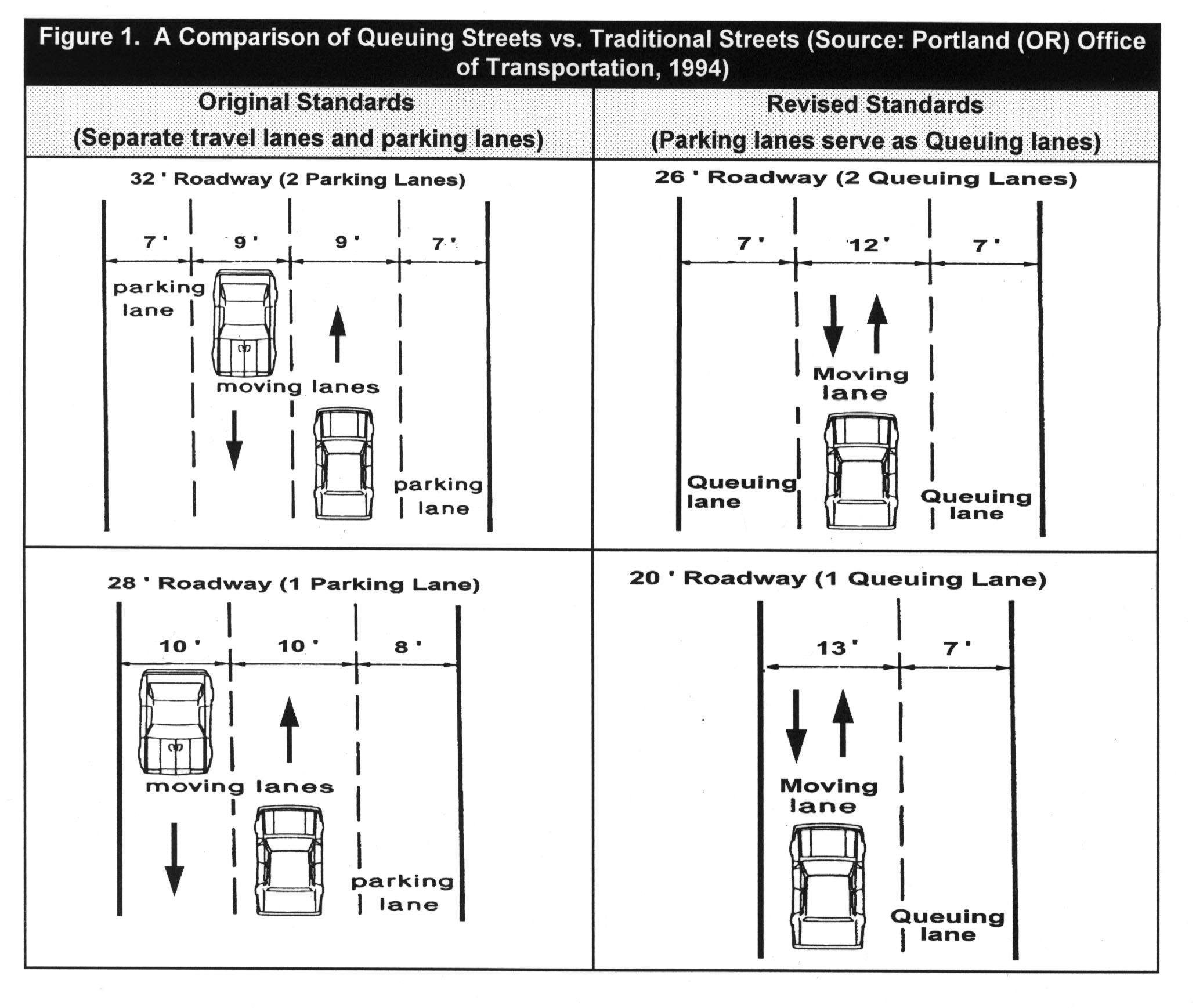
A guide by the Stormwater Manager's Resource Center in Maryland (funded by the EPA et. al.) states that roads can be as narrow as 22 to 26 feet and still allow access for emergency + large vehicles (Kyoto's Sanitation Services: "duh"). The guide is a bit paranoid contingent and not quite narrow enough for me, but it's a start. It still doesn't overcome the whole chicken-and-egg thing, either: streets, it says, must take into account existing traffic volume. But streets invite volume, especially if built too wide. Narrower streets, when dovetailed with excellent public or individual transport options, can give people solid reasons to give the car the day off. Read more.

Wednesday, December 16, 2009

video: charley in new town (1948)


Absolutely brilliant 60 year old British cartoon about urban planning. Most interesting are the features they depict as most desirable: public gathering spaces, close distances, neighborhood social services, a civic center, and even lots of pubs. "If you can make a muck-up of things, you can put 'em right." Indeed!

reader request: sunset boulevard, echo park (I)


Reader Marc Phu sent in an enthusiastic request (my first evar!) to shoot Echo Park's main drag, and I was more than happy to oblige by scooting out there one Sunday morning. Sunset Blvd. stirs with life early on, with bus commuters chatting in their queues and vendors selling savory goodies like tamales. But it also suffers from that classic LA reality gap: despite having a de facto 25mph business district speed limit on paper, the street is built six lanes wide for speed and routinely allows traffic to barrel through at 50mph. Calming those rapids by narrowing the thoroughfare would let Echo Park's colors really shine through, up close + personal. See it narrowed!
Diptych prints available

Tuesday, December 15, 2009

get involved: "complete streets"


The National Complete Streets Coalition holds workshops + helps fund federal policies that promote the creation of streets for everybody, not just cars. Wide streets are problematic for mobility and ecology, says the site, adding that they can be unpleasant or, worse, unsafe, for anyone traveling along or across via foot or bicycle. That's something Angelenos already know all about. Learn more and get involved!

Monday, December 14, 2009

melrose avenue near gardner street, melrose district


The hip part of Melrose (as opposed to its frighteningly expensive sections in West Hollywood) is a shop-hopper's paradise, with block after block of endlessly changing boutiques. Tracing the walking patterns of shoppers would most likely reveal a series of U-turn paths travelling up the street, then crossing the avenue's six car widths in order to promenade the other side. But instead of being limited to such systematically linear behavior, what if those trajectories were allowed to safely criss-cross at will, as if drawing the street together with invisible laces? Possibilities would open up, along with shoppers' wallets. Cinch it together!
Diptych prints available

Friday, December 11, 2009

friday favorites: kyoto, japan


Reader Marc Phu sends in his favorite for this Friday: a garbage crew squeezing past a corner on a cozy street in Kyoto, where the philosophy is not to build wider streets, but to simply use smaller trash trucks!

Every friday we'll post our favorite narrow streets from around the world. Got a friday favorite of your own? Send in your photos!

Thursday, December 10, 2009

meet jon lind of de fietsfabriek dutch cargo bikes


I was lucky enough to stumble upon these beautiful Dutch cargo bikes on my way to work this morning. They're distributed by the uber-friendly Jon Lind, founder of De Fietsfabriek, a company that distributes these useful bikes here in the US, where most people consider bikes to be impractical toys for either children or wealthy jocks. Jon has lived in Amsterdam and returns frequently, which is where he caught the bicycle bug big time. More pix of these sweet machines at my flickr photostream.

Free this weekend? Come meet Jon for yourself! De Fietsfabriek will be participating in the Save Scooby-Roo Rescue Ride this Sunday, meeting in front of the Healthy Spot dog supply store at 1110 Wilshire Blvd. in Santa Monica. Here's the official flyer.

guerilla activism: do-it-yourself "sharrows"

Sharrows, street markings that encourage car people to share the road with bicycle people, have grown from a DIY form of outlaw guerrilla activism in places like Northeast LA to becoming an officially sanctioned part of street design in progressive cities like Glendale. Hooray for DIYers--sometimes it's better to get out there than sit around waiting for permission.

Sharrows remind us that roads are psychological constructs. Lanes are just paint on asphalt. Traffic signals, red or green, can't actually stop moving objects. Like ink on paper, they suggest in our minds a reality, and are as changeable as perception: for instance, a dotted-line merge lane from the 10N to 405N freeways wreaked havoc on traffic until it was changed back into a solid-line, travel-only lane. I know this because my wife's commute was ruined for that short while, and I could feel her stress level when she got home. Quite a ripple effect just from some misplaced paint!

As badly needed as sharrows are, they're not the sole answer. Painting sharrows on a superwide, cars-only street like La Brea Blvd. won't make it any more fun to cycle along. But it's not all chicken and egg here--sharrows could be that daily reminder to nudge fence-sitters just over the edge into placing their votes for real change: infrastructure.

Feeling daring? Download your own sharrow template and spark some change!

Wednesday, December 9, 2009

wilshire boulevard + 9th street, santa monica


Santa Monica's Wilshire Boulevard is an oddity. Posted speed limits never exceed 30 mph, and crosswalks mark the road at regular intervals. Despite these best of design intents, real-life Wilshire is a hotbed of tension, road rage, and regular crashes. Once, I even saw an SUV flip completely over. Serious stuff for a local 30 mph road, right? The problem of course lies not in the design's intent, but in the actual manifestation of the design itself, whose seven rail-straight lanes of smooth asphalt implicitly promise freedom but explicitly (through signage) tell drivers to use restraint. It's this dishonesty in Wilshire's design that causes all the frustration. So, builders? Signs + road paint just polish the turd past a certain point. If you really want to make a street safer, you should... narrow it down!
Diptych prints available

Tuesday, December 8, 2009

cast your vote: people powered movement photo contest


Head over to The Alliance for Biking & Walking to root for your favorite photos in their Tuscany Bike Tour photo contest. It's not just pix of bikes + pedestrians (not that there's anything wrong about that) but also of complete streets and inspirational imagery.

get involved: the livable streets initiative


The awesome folks over at the Livable Streets Initiative have a fascinating overview of the burgeoning "skinny streets" movement, which aims to overcome the vestigial concerns (room for a four-horse wagon to make a U-turn?!?!) and paranoid contingency plans (passing lanes for military vehicles?!) that left us with a legacy of overly-wide streets and all the danger they invite. Read up & spread the word!

Monday, December 7, 2009

la cienega boulevard, restaurant row


If you've ever been to Lawry's or The Stinking Rose, you know what Restaurant Row is all about: massive quantities of awesome food served with Vegas flash. You also probably know where most of the action lives: in and around the parking lots. With seven intimidatingly fast lanes of traffic swirling around right-hand lane car queues (and their legions of attending valets), it's odd + interesting that the buzzing activity outside each restaurant revolves around the mundane transaction of paying someone to take your car off your hands. Narrowing the street would cinch the dining throng tighter together, encouraging an activity everyone actually enjoys: people watching! See it narrowed!
Diptych prints available

Friday, December 4, 2009

friday favorites: shibuya, tokyo, japan


Your humble editor near Shibuya Crossing, getting lost in translation.

Every friday we'll post our favorite narrow streets from around the world. Got a friday favorite of your own? Send in your photos!

Thursday, December 3, 2009

david owen's "green metropolis": what do new yorkers + swedes have in common?


Answer: they have the same carbon footprint. This is thanks in part to NYC's verticality, which makes it 30 times more dense than, oh, Los Angeles..? Owen urges everyone to live smaller, live closer, and drive less--three things worth cheering for. Learn more.

Wednesday, December 2, 2009

arden boulevard + 6th street, hancock park


Wooded, sun-dappled Hancock Park lives in a paradox. It wants so badly to be a slice of English countryside nobility, yet its Tudor mansions are situated right alongside 50 mile-per-hour traffic. Putting its too-wide streets on a diet would bring the dream closer to reality, bunching foliage together to create a lovely arched treeway to mesmerize oneself with while gliding along at a whisper in a restored Jaguar convertible. Show it narrowed!
Diptych prints available

Tuesday, December 1, 2009

respect: matt logue's "empty LA"


Photographer Matt Logue, the original Great Eraser of Traffic, has earned tremendous acclaim for his haunting panoramas of a Los Angeles without a trace of cars or people. His series, now available as a book, is both appropriately apocalyptic and revealing at the same time: all that dehumanizing (yet starkly beautiful) asphalt sparks the imagination into wondering what cities could and ought to be. More pics + info at his official site.

CNU video contest winner: remix urban spaces now!


The inspiring winner of the Congress for the New Urbanism's 17th video contest, entitled "Built to Last," argues that cul-de-sacs are killing us (nice!) and now's the time to start re-mixing, re-imagining, and re-configuring our urban spaces. You already know we at NSLA are down with that. Kudos! Via cnu.org

Previous Posts

About the Photographer

Los Angeles, CA, United States
Writer, designer, and urban planning geek.

Got a location idea or photo submission? Send it to hello@davidyoon.com. I'll post it to the blog or even run out to shoot it myself.

friends

Other sites by David Yoon
Microlawns
Personal site

Kindred Spirits
Tom Baker, LA Without Cars
James Howard Kunstler

Friends
Nicola Yoon Design
SIFT Angeles

Followers

All content © David Yoon and Narrow Streets: Los Angeles.