Tuesday, March 30, 2010

video: my 2010 LA streetsummit presentation


My slideshow presentation, with audio graciously provided by Streetsblog Editor Damien Newton. It's 36 minutes long, so be sure to prepare a beverage and maybe a snack. Workshop description:

Urban design tends to remain invisible for most people — until something drastic happens to shake things up. That's the mission of Narrow Streets: Los Angeles, a project where I take photos of our city's famously wide roads and narrow them down using Photoshop. In the process, the photos reveal a suddenly non-car-centric vision of L.A. designed to spark the viewer's imagination and emphasize how important street design can be in affecting our daily lives.For this workshop, I'll present an overview of studies regarding wide street safety, livability, and property value before reviewing street traffic calming design strategies and the virtues of narrow, human-scale streets. Then, we'll use narrowed photographs to facilitate a freeform discussion about the current state of street life in L.A. and how we could improve things in the future. I'll also demonstrate my photo editing process for those interested in taking urban landscapes of their own.


After the slideshow I invited people to engage in a freeform discussion. Here's a transcript of our lively conversation.

Monday, March 29, 2010

helms avenue at the helms bakery, culver city


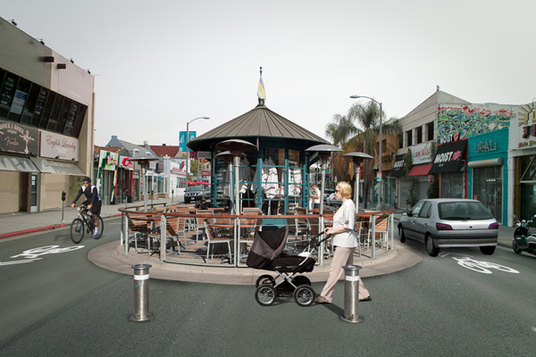
Let's start of the week with a little departure from the norm. Here's a shot of Father's Office at Helms Bakery from a year ago, when Helms Avenue ran straight through the bakery compound. Back then, shoppers squeezed themselves to the margins of the street and had to be ever aware of oncoming traffic. But since then, the Culver City Bicycle & Pedestrian Initiative has pedestrianized the area, closing the street to traffic and adding wonderful details like a fountain, benches, cobblestone texture, and these awesome solar-powered bollards.


Read the whole list of future developments. Big kudos to Culver City for taking the initiative to make their streets more livable! See it...pedestrianized!

Thursday, March 25, 2010

2010 LA streetsummit: coverage wrapup


Here's a list of all the fantastic coverage of the 2010 LA StreetSummit on the ever-awesome Streetsblog, in case you missed it — including tons of well-crafted video.

Streetsblog editor Damien Newton said people thought my workshop was "show-stealing"! Gah!

Anyway. I'm working on putting together an audio slideshow of my presentation. Stay tuned!

friday favorites — thursday edition! vintage los angeles photos


Image via A Continuous Lean and Neat Stuff Blog.

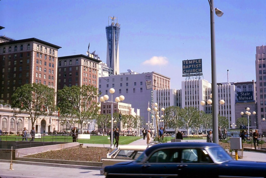
I'm posting this week's Friday Favorite a day early because I'll be on hiatus tomorrow (it's mah birfday. Wahoo!). Anyway, here's Pershing Square in 1965, before it had been walled off as the elevated concrete plaza it is today:


Photo by Candice (Bessie Smith)


Every Friday I'll post a narrow or otherwise interesting street snapshot from somewhere around the world. Got a Friday Favorite of your own? Send me your photos!

Wednesday, March 24, 2010

santa monica boulevard + century park west, century city


On paper, Santa Monica Blvd. seems like a farily progressive street. It's got bike lanes, frequent bus transport, and a good number of businesses mixed with residential buildings. It connects Westwood to Century City to Beverly Hills — all major destination spots. But the boots-on-the-ground experience is very different.

Tuesday, March 23, 2010

2010 LA streetsummit: envisioning urbanism photo gallery


Did I mention I put together a little group photo exhibit at the LA StreetSummit? Well, here it is! Lots of great folks agreed to participate:
  • CicLAvĂ­a, the group trying to get LA car-free days
  • Dutton Architects, repurposing LA's freeways as a "Greenway"
  • Torti Gallas & Partners, with their exquisite before/after renderings
  • Maggie Leighly, a contributor hailing from El Cerrito in northern California
  • Diane Meyer, with her portraits of Angelenos who live car-free
  • and...me!

The photo exhibit starts here on my flickr stream.

Monday, March 22, 2010

2010 LA streetsummit: what i learned


My report from the wonderfully inspiring 2010 LA StreetSummit is up on Shareable.
There’s never been a better time to get involved. So much has been accomplished since those early efforts by a few lonely cycling activists. LA has run out of excuses, especially now that other cities — including not just New York but Minneapolis, Seattle, and Tucson — have quickly surpassed our City of Angels in the Great Public Space Race.

Read the full article over at Shareable.

grand avenue + 22nd street, los angeles


As the 2010 LA StreetSummit drew to a close, I couldn't resist taking a parting shot of the LATTC campus. See it narrowed!
High quality prints available

Sunday, March 21, 2010

2010 LA streetsummit


Thanks to the ingenious John Leung for the pic.

LA StreetSummit 2010 was a huge, huge success. Humongous congratulations to UEPI and Ramon Martinez for all their hard work. And my talk was big fun, too — lots of laughs and friendly banter. I'm taking a little break to rest up from all this exhilarating activity but I'll post updates soon. See you in a bit!

Friday, March 19, 2010

engineering bikeability for fun + profit: my article on planologie


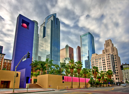
I wrote an article for the fabulous Planologie about the potential gold rush that could be had by infilling our megawide streets with new business, featuring this crazy photo mashup. Can you tell which two locations I used?
Why engineer for bikeability? The usual design approach is to paint a stripe, call it a bike lane, and watch helplessly as no one uses it. Bike lanes on [a] six-lane-wide [road] wouldn’t make it that much nicer for cyclists, what with cars routinely speeding by at 45mph. Engineering for bikeability isn’t just about providing traffic infrastructure — it’s about giving people a reason to bike. And the biggest reason people go anywhere? Commerce.

Read the full article.

meet janette sadik-khan


The 2010 LA StreetSummit kicked off last night at Occidental College in Eagle Rock with a lecture by New York City's Department of Transportation Commissioner Janette Sadik-Khan: a bike advocate, complete streets engineer, and all around uber-sweet human being.

In reviewing the incredible successes of PlaNYC's pedestrian- and bike-friendly initiatives, Janette made sure to emphasize a few key points of her overall design philosophy. To paraphrase:
  • Urban reform doesn't have to be expensive or complicated. You can do a whole lot with a can of paint and some imagination to paint the city "green."
  • Urban reform doesn't have to involve huge sweeping changes. Instead, experiment bit by bit in small increments. If it doesn't work out, no bigs — change it back and move on. If it does (e.g. the awesomification of Times Square) make it permanent.
  • Safety is paramount. Use women + children as your benchmark, not spandex-clad cycling evangelists. If moms + their kids don't feel safe cycling on the streets, you've still got work to do.


She spoke to a packed auditorium that interrupted her talk with frequent fits of spontaneous applause, followed by a lengthy Q&A session propelled by a palpable hunger for advice and wisdom on how to achieve similar results — i.e. 200 miles of new bike paths in 3 years! — right here in LA. Janette's combination of idealism guided by pragmatism gives her an utterly charming small town sensibility, only applied to a massive, world class setting like New York City. An amazing person. Someone build a freaking statue of her already.

More pix of this inspiring night on my Flickr photostream.

friday favorite: the shambles, york, united kingdom


Photo: VT_Professor.

Here's The Shambles, one of the most famousest streets in the UK and winner of Google Maps's first ever "Most Picturesque Street" contest. Oh, glorious narrowness. I die from charm.

The contest has inspired The Huffington Post to ask its US readers which street they think is America's most picturesque. I'm a big fan of Elfreth's Alley, Philadelphia.

Every Friday I'll post a favorite narrow street snapshot from somewhere around the world. Got a Friday favorite of your own? Send me your photos!

Thursday, March 18, 2010

venice boulevard + helms avenue, culver city


Ah, Helms Bakery. It's like a home-making, feather-nesting Disneyland for grownups, complete with gourmet carnival food (Father's Office burgers, the Let's Be Frank hot dog truck). But few know the secret identity of Venice Blvd., the street adjacent to Helms. At first glance, it's just another product of LA's insane civil engineer clown posse: a crazy ten-lane wide airstrip of a road running rail-straight for miles, built as if meant to be seen from low orbit, with cars routinely reaching 50 or 60mph. But look closer: there's a bike lane! Trace it on a map, and you'll realize that it's the longest bike lane in all of Los Angeles County, stretching nine miles from Crenshaw Blvd. to the sea — in essence, it's the closest thing to a bicycle boulevard LA has. All that needs to be done is to make cycling on Venice an actually pleasant experience, instead of the freeway-like battle it currently is. See it narrowed!
High quality prints available

Wednesday, March 17, 2010

reminder: the 2010 LA StreetSummit is this saturday!


Hey kids! StreetSummit is this Saturday, March 20, at the LA Trade Tech College's new South Campus towers + quad at the corner of Grand Avenue and 22nd Street.

The summit begins at 10:30am. I'll be giving a workshop entitled Imagining a Narrower LA: The Everyday Impact of Urban Design from 2:00 - 2:50 pm.

There'll also be a photo exhibit featuring my work and some great visualizations by Colleen Corcoran at CicLAvia, Dutton Architects, Torti Gallas + Partners, and Maggie Leighly.

See you there! Don't forget to register before you go!

happy st. patrick's day!


Photo: Sergiocruz.

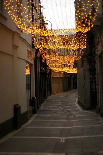
A special favorite for today's holiday! Ireland's world-famous Grafton Street: narrow, alive, and full of wonder around every corner:


Photo: liamandagnieszka.

reader request: wilshire boulevard + westwood boulevard (I)


Thanks to Donald Weller for the location request.

UCLA has never had a strong college town feel to me, and I suspect Wilshire Blvd. has a lot to do with it. Don't get me wrong: I love Westwood with all mixed-use fun. But just look at Wilshire. At an absolutely insane ten lanes wide, this rubicon effectively prevents the Village from expanding in any real way — indeed, head south on Westwood-past-Wilshire and you'll notice the bars vanish, and the restaurant choices get just a little more expensive (no chance of finding a Diddy Reese there, for example).

Here, lights regulate every kind of maneuver imaginable — crosswalk countdowns, No Turn On Red LED signage, double-lane controlled right turns, double-lane controlled left turns — instilling in drivers (and those on foot) an anxiety so utterly complete that all conversation momentarily stops. More equals less in a situation like this, something its traffic-engineers-gone-wild probably don't understand. Full of movement but empty of life, this intersection is a classic example of overdesign. See it narrowed!
High quality prints available

Tuesday, March 16, 2010

TED talk: Gary Lauder's solution to pointless stop signs


Thanks to Jennifer Stoeck for the tip.

Virtuosic, blustery 3-minute etude on the overwhelming safety of roundabouts, the pointless economic + environmental waste of stop signs, and a proposal for a delightfully new kind of traffic sign. Via CNN's TED Talk Tuesdays.

why i am obsessed with obesity


Infographic from the original BBC article entitled "Slimming Sixties Not a Myth."

Charts like the one above fill my eyes with the wonder + curiosity that comes when facing the massive ironies of life. It makes me feel like I'm standing at a weird point in the timeline of humanity, a historical blip people will later snicker at with incredulity — much like we currently do when (say) looking at old cigarette ads featuring doctors. I argue that each of the lifestyle shifts above can be traced down to one common factor: a world increasingly designed around cars.

Sure, it's not the only factor, but hear me out.

Monday, March 15, 2010

melrose avenue + westmount drive, west hollywood


Don't let its egalitarian-sounding name fool you — WeHo's Avenues of Art + Design are a secret triangular enclave where the rich + famous go for spa days or nest-feathering excursions at ultra-high-end galleries and home furnishing stores (if you can call a $4,000 chrome vase a home furnishing). It's all charming enough, I guess, if predictably devoid of foot traffic (could you imagine the paparazzi?). Except for this little pocket of activity here at Urth Cafe, where I once got the ped-wave from Jason Statham as he strolled across the crosswalk in front of my car. Wahoo, star gazing! Right. So. I find there's not a whole lot to say about the wealthier parts of our fair city, whose coldly stylish streets would be just as frigid whether they were 2 or 200 lanes wide. Community + public space just don't matter to people with enough cash to create their own private kingdoms. Let's just enjoy the narrowed view then, shall we?
See it narrowed!
High quality prints available

Friday, March 12, 2010

friday favorites: nord alley, seattle, washington


How nice is this? It's a shot of competition display night party for the recent Green Alleys Competition, in which architects took Seattle's alleys and made them livable. The one above is in historic Pioneer Square. Via MyUrbanist, who has a great 12-point list of urban "placemaking" principles with strong echoes of Christopher Alexander's A Pattern Language:
  1. Emphasize an alluring focal point.
  2. Use hanging green.
  3. Use simple, green plantings and encourage ornamental building features in the path of view.
  4. Where possible, enhance multi-level exposure to vernacular buildings amid the urban fabric.
  5. Provide varied forms of encounter with surrounding commercial uses.
  6. Celebrate exotic signage.
  7. Provide for a multi-color, mixed use environment.
  8. Together amplify angle, color and texture to highlight organic street life.
  9. Enhance structural features to frame places enroute.
  10. Celebrate the marketplaces of vending and dining.
  11. Make angles magical.
  12. Highlight iconic buildings.

Every Friday I'll post a favorite narrow street snapshot from somewhere around the world. Got a Friday favorite of your own? Send me your photos!

Thursday, March 11, 2010

i'll be at LA streetsummit...will you?


It's time for the 2010 LA StreetSummit! It's a gathering of community residents, activists, and researchers at L.A. Trade Tech in Downtown LA, coordinated by the ever-dedicated Ramon Martinez. It's on Saturday, March 20.

I'll be there, giving a workshop entitled Imagining a Narrower LA: The Everyday Impact of Urban Design at 2pm.

There'll also be a little photo exhibit featuring work by NS:LA, CicLAvia, and contributors to GOOD Magazine's 2009 Livable Streets photo contest. Come on by! It'll be fun!

rodeo drive + dayton way, beverly hills


I've mentioned cartoon places (like The Grove) before, and to the left of this shot of Rodeo Drive there's one of the cartooniest places in LA: a little strip mall designed to look like a charming, car-free street straight out of Paris, complete with ornamented bollards, cobblestones, and even an incline for a dash of naturalism. Its artificiality is exacerbated by Rodeo Drive itself, a five-laner that, while well-appointed with street furniture like medians and bulbs, is otherwise your typical American drag strip: straight + narrow, with its cars all itching for speed. Narrowing Rodeo makes that little incline feel less like a one-off novelty and more like a properly integrated part of the city. See it narrowed!
High quality prints available

Wednesday, March 10, 2010

meet ramon martinez


I'm honored to say that Ramon has been a fan of NS:LA pretty much from the start, and he's one of the most dedicated + driven people I've had the pleasure of encountering. He helps day laborers fix their bikes for free; he lobbies the city for bike- and walker-friendly urban initiatives; he's a tireless advocate for sustainable streets.

He also helps coordinate the 2010 StreetSummit, an annual gathering of community residents, speakers, and researchers devoted to complete streets on March 20 at LA Trade Tech in downtown LA. I'll be there too, giving my own workshop entitled The Everyday Impact of Urban Design. Everyone's invited! :)

Read more about Ramon at a recent LA Times profile article.

wilshire boulevard + curson avenue, miracle mile


I have a thing for utopian placenames: Century City, Hawaiian Gardens, Universal City. They represent someone's relentless optimism, a brazen Ayn Rand-ian ambition that refuses to accept irony. Take "Miracle Mile": a strip of Wilshire deliberately designed for a once-new car age, first ever in the nation with dedicated left turn lanes, timed signals, and street signage big enough to be read at 30mph — a harbinger of car-centric things to come.

Giving a street such a grandiose name is of course fraught with disappointment given the plain, flat light of everyday reality, and the now-90-year-old Miracle Mile is not immune. It hasn't aged well; its one-note scale + aesthetic just feel like a bad habit. It's a traffic chokepoint, and hungry E! employees must wait forever just to cross the street for some Koo Koo Roo. So howsabout this: let's leave utopia to those crazy new-worlders in Dubai or Shanghai. Let's get over our grand visions of the future; let's get smaller + comfier. And then let's get lunch. See it narrowed!
High quality prints available

Tuesday, March 9, 2010

grand avenue + 1st street (southwest), downtown


Despite being known for its innovation, LA can be a pretty monotonous city, with most buildings following a single, odd format: cars park in the rear and visitors enter from behind, causing street-facing facades to become dead spots with disuse. Even the Disney Concert Hall, one of LA's greatest monuments, follows this car-centric layout, creating an eerie lack of street life even on big show nights. This standard "Parking in Rear" layout, however innocent, has the unexpected effect of creating the isolated destinations our city is so famous for -- allowing contradictions like the drama of a sublime architectural wonder juxtaposed to the utter banality of a parking structure directly across the street. Narrowing this scene highlights this paradox; the left side of Grand suddenly begs for cafes, shops, and bars. See it narrowed!
High quality prints available

Monday, March 8, 2010

my parents’ house


I remember when my family first moved out of the crime + noise of '70s LA and into the suburban havens of Orange County. Orange County had zero cachĂ© back then (no one called it "The OC") but it did have plenty of sun, space, and quiet. It was half rural, with most subdivisions still sharing land with nearby fields of bean, lettuce, and strawberry. I remember the huge, futuristic scale of its new-for-1977 homes, with their giant rooftop foreheads and facades dominated by garage doors: each house a rectangular prism formed by two large blank planes, with just the lower right corner reserved for a dash of faux-period styling. Turns out this minimalism was a great cost-cutting measure, a kind of artificially flavored, starch-heavy architectural recipe that becomes pretty evident when you narrow the sucker down — it's as if they took a somewhat normal-looking cottage and stretched out the cheap parts for the sake of volume. Still, I love my parents' house, and like the junk food of my tween years it inevitably has become a nostalgia-driven part of my aesthetic. See it narrowed!
High quality prints not available ;)

Friday, March 5, 2010

interview by openalex


Alex Aylett posted a fun skype interview with me on his lovely blog openalex in which he calls me an "almost accidental activist," ha. :)

Alex also writes for the equally awesome WorldChanging, making him a super-duper double-threat urban sustainability ninja.

friday favorites: lucca, italy


Depth, drama, and mystery, all packed into a street not 20 feet wide.

Every Friday I'll post a favorite narrow street snapshot from somewhere around the world. Got a Friday favorite of your own? Send me your photos!

Thursday, March 4, 2010

culver boulevard + cardiff avenue, culver city


I love Washington Square. Everyone loves Washington Square. Parking structures are tastefully hidden away out of sight; great food abounds, with outdoor seating placed away from traffic; and hey, there's a few theaters, too. This whole Asian-fusion enchilada is deftly bookended by an iconic Flatiron-esque hotel at one end (above) and the dapper Kirk Douglas theater at the other, clearly defining the district and giving it historical context.

It's just that every time I go there, I have an awkward time crossing the street. Everyone does.

Wednesday, March 3, 2010

washington boulevard terminus, venice


Southern California has always had an odd attitude about its beach towns. From Laguna to Huntington to Venice, beaches were once thought of as either crude campgrounds or not-so-nice places to live: makeshift shantytowns for dirty hippies + scary Hell's Angels types. Our attitudes since then have of course completely changed, to the point where the phrase "beachfront property" has become a cliché indicating the highest echelon of lifelong real estate aspirations — but the beach, no matter how you dress it up, still has a slapdash foundation rooted in the past. You can see it in the almost complete lack of amenities along the Strand; in PCH's eight lanes of freeway-speed traffic; in Santa Monica's big blacktop binge, with more space dedicated to parking than to her world-famous pier itself; and finally here, at the place where Washington Blvd. (LA's longest east-west artery) unceremoniously meets the ocean as a herringbone lot. Venice maintains its charm despite being saddled with legacy infrastructural oddities (i.e. the bike-hostile Speedway Pacific Avenue), and with narrower streets it starts to less like a truck stop and more like the scruffy, laid-back beach bum we all love. See it narrowed!
High quality prints available

Tuesday, March 2, 2010

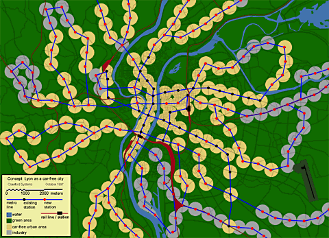
jh crawford on carbusters.org: making today’s cities carfree


Above: Crawford's 1997 plan for a carfree Lyon.

JH Crawford, author of Carfree Cities and personal hero, has an article up on Carbusters, kickin' ass + droppin' science. He rocks my little world.

I do not foresee that cars will completely disappear. Eventually, their use in cities will be largely or entirely prohibited, but a transport mode that reaches rural areas is required, probably involving some continued use of private cars. The interface between rural cars and the city thus requires careful planning. I propose simply to build multi-story parking garages (preferably underground) at the city’s edge for visitors’ cars and car-sharing vehicles. City residents who regularly need a car to travel outside the city could rent a space. These garages must be linked to the city by good public transport. This is, of course, less convenient that driving directly to a destination within the city and will discourage people from using cars unnecessarily.

Read the whole article »

main street + hill street, santa monica


Main Street in Santa Monica is one of the rare streets in LA with a true mix of transportation modes: you've got respectable numbers of walkers, busses, cars, bikes, rollerbladers, skateboarders, longboarders, unicyclists — you name it — all movin' right along at very moderate speeds to + from a nice variety of retail ranging from high-end boutiques to the more utilitarian car washes + cafes. It's a less car-obsessed street than most (unlike its high-strung neighbor Neilson Way), despite still being five lanes wide. One bright day, while waiting for my jewelry-obsessed wife to finish gemstone shopping, I wondered: how would it look with more honest proportions — proportions that better reflect its actual character? Narrowed, Main Street's sidewalks begin to feel wider. Building details, like the ornamental brickwork to the right, come into closer focus. And with less black asphalt around, this already sunny street becomes that much sunnier. See it narrowed!
High quality prints available

Previous Posts

About the Photographer

Los Angeles, CA, United States
Writer, designer, and urban planning geek.

Got a location idea or photo submission? Send it to hello@davidyoon.com. I'll post it to the blog or even run out to shoot it myself.

friends

Other sites by David Yoon
Microlawns
Personal site

Kindred Spirits
Tom Baker, LA Without Cars
James Howard Kunstler

Friends
Nicola Yoon Design
SIFT Angeles

Followers

All content © David Yoon and Narrow Streets: Los Angeles.