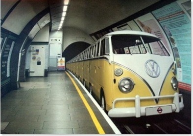
A classic Volkswagen Microbus, put to much better use. Thanks to reader Marc Phu for the tip, via the Racionais Pra Tudo tumblog.
Every Friday I'll post a narrow or otherwise interesting street snapshot from somewhere around the world (or in this case, a striking photo mashup!). Got a Friday Favorite of your own? Send me your photos!
Friday, April 30, 2010
Thursday, April 29, 2010
thursday do-overs: american makeover's "sprawlanta"
The average Atlantan drives 60 miles a day? "Drive 'til you qualify" for affordable housing, indeed. Filmmaker John Paget continues to kick ass all over the place with his great documentary, which is peppered with eyebrow-raising factoids such as "3 pedestrians get struck every week" on the streets of Atlanta (many of which routinely stretch 8 lanes wide). Or how about: Gone With the Wind author Margaret Mitchell was killed crossing the street in this city — an idiot death for such a brilliant writer.
This film makes its point loud + clear: the time is ripe for a major do-over on a nationwide scale! Maybe it's time for a Narrow Streets: Atlanta edition..?
Wednesday, April 28, 2010
sunset boulevard + doheny road, west hollywood
If you head just west of the Key Club on Sunset Strip, stop at Gil Turner's liquors, and look downhill, you'll see this long downhill view. It's a bit vergitinous, and cars do indeed bomb down it at speeds reaching 50mph. All the roads perpendicular to the Sunset Strip are like this: a deadly matrix of intersections that invite danger. I should know: I used to work in this neighborhood, where a motorcyclist lost his life one day.
Tuesday, April 27, 2010
google search story: "LA street story"
My YouTube Search Story, about a search for escape from car commuting that becomes the inspiration for positive change. This Search Story thing is fun!
I just had to show how NS:LA seems to show up a lot in Google image search, which is how about a third of my visitors find me. Wacky!
Monday, April 26, 2010
wilshire boulevard + 3rd street promenade, santa monica
This is probably one of the most well-populated intersections in Santa Monica, in terms of foot traffic, being situated at the end of the 3rd Street Promenade as it is. It's not without its problems, however — cars waiting to make left turns creep impatiently toward the throngs of crossing pedestrians, spoiling the shopping fun by unnecessarily rushing tourists + locals alike. It's also dangerous, too: pedestrians get hit most by cars making careless left turns, especially at larger intersections where the line of sight is more distant. 3rd + Wilshire is a perfect candidate for conversion into a public square, with a fountain or statue in its center. But for now, let's imagine that the charm of the world-famous Promenade follows through all the way to its terminus and beyond, with a nicely narrowed street that clearly indicates who it belongs to: the people! See it narrowed!
High quality prints available
Friday, April 23, 2010
friday favorites: tyler street, dallas, texas
Something amazing: local residents and Go Oak Cliff + Bike Friendly Oak Cliff members transform a blighted, car-wild street in human-hostile Dallas into an irresistible public space right out of old Yurp. I love the dramatic difference in traffic speed before and after conversion — the latter sense of safety is clearly apparent. The whole project perfectly highlights what complete streets do best:
- Slow traffic with narrower streets
- Encourage jaywalking
- Create bonus retail space
- Give people a no-pressure reason to be outside: not to commute, or run a 10k, but simply to relax!
Apparently this inspiring fit of guerilla activism was so successful that Dallas DOT wants to make some of the changes permanent. And two other Texas cities have asked the BFOC to re-create the event in their streets, too.
Nice to see this bunch of "complete" freaks in action!
Via Bike Friendly Oak Cliff.
Every Friday I'll post a narrow or otherwise interesting street snapshot from somewhere around the world. Got a Friday Favorite of your own? Send me your photos!
Thursday, April 22, 2010
do-over thursday: time-lapse narrowing fun!
Remember that Spring Street bridge I narrowed a little while back? Well, here's how I went about it. View full-screen to see the interface details better.
I used Photoshop, but there's plenty of free, open-source altenatives, including GIMP. The key is getting your initial shots nicely aligned.
Wednesday, April 21, 2010
pico boulevard near vermont avenue, byzantine-latino quarter
Thanks to Nirad Gupta at SIFTAngeles for the location request.
I came here to shoot photos at 9am on Easter Sunday, and even at that early hour the streets were already filling up with 50mph traffic. But during the periods of silence in between packs of swiftly moving cars I was able to focus on the human face of the neighborhood's soul: its considerable foot traffic. Foot traffic which, on a narrower street, feels more at ease.
On paper, the Byzantine-Latino Quarter has a long, rich record of ethnic ebb + flow; a neon sign and inspirational mural on the corner of Pico + Normandie give clues to those origins. Otherwise, it's tough to get a sense of any of its history at street level. The BLQ is crying out for a public square to physically mark its center and give the neighborhood a sense of permanence — its official center at Pico + Union only features disappointingly typical stripmall carchitecture. But streets this wide + fast defy public space. Like most designations in LA its identity seems temporarily written, an abstract construct of the mind marked only by blank rivers of asphalt; a figment poised to be gentrified into oblivion without even a statue to mark its passing. See it narrowed!
High quality prints available
Tuesday, April 20, 2010
visualization fix: green island
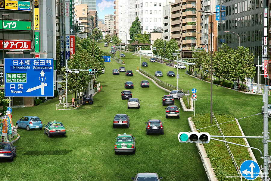
An oldie but a goodie: Green Island by tag, IMKW, and immr in Japan. I've actually had dreams along these lines, where all the asphalt of the city was replaced by fields of green. In my dreams people would drift race like maniacs on the slippery grass to wherever they were going, the smell of freshly muddled sod in the air. Really fun, actually.
These fantastic, outrageous visualizations are the next best thing to dreams. It's amazing how green grass brings an instant sense of calm to a normally chaotic scene. The creators behind Green Island don't do many of these, but when they do they're always impeccably detailed + stunning. They've even branched out to France, Vietnam, and right here in US, in Las Vegas:
Monday, April 19, 2010
alley between 3rd + 4th streets off the 3rd street promenade, santa monica
Remember that alleyway in Santa Monica with Westside Comedy Theater? The one that's just dying to have a bar put in next door? Well, I revisited it.
Alleyways are such a restrictive form of urban design — they separate + compartmentalize the "uglier" functions of the city, i.e. trash collection, and unwittingly create creepy, crime-ridden dead zones in the process: a telltale sign of an unhealthy monoculture. Cities like New York or Paris mix things up more, putting smaller batches of trash out in the open for more frequent pickups. Their streets may smell a little more ripe, but they're still nothing compared to the rank, concentrated fumes lurking in LA's cesspool alleyways. Distributing functions more evenly across the urban system (even the smellier ones) would reduce restrictions on what alleys can + can't be used for. And it would also literally open up miles of fresh real estate for entrepreneurs to play with. So with that in mind, I installed a bar next door to this comedy club: the Cabo Cantina, transplanted from just one street over on the 3rd Street Promenade. Hellooo, fun! See it bar-ified!
High quality prints available
Friday, April 16, 2010
friday favorites: long tang street, shanghai, china
Photo: PitBox.
I saw plenty of streets just like this one when I travelled around China years ago. At only 8 feet wide, there's still plenty of room for scooter parking, laundry, life, and mystery.
Every Friday I'll post a narrow or otherwise interesting street snapshot from somewhere around the world. Got a Friday Favorite of your own? Send me your photos!
Thursday, April 15, 2010
do-over thursday: NYC DOT's open call for public space proposals!
This is incredible. New York's Department of Transportation, headed by the supergreat Janette Sadik-Khan, has opened itself up for proposals to reclaim wasted city space to create new public plazas. It's an amazing effort to get locals involved in defining their environments and improving their quality of life — what a concept! From the overview:
NYC DOT will work with selected not-for-profit organizations to create neighborhood plazas throughout the City. We will do this by transforming underused streets into vibrant, social public spaces. This Program is a key part of the City's effort to ensure that all New Yorkers live within a 10-minute walk of quality open space.
The deadline's June 30, 2010. I can imagine some really sweet visualizations will come out of this call-to-arms. Urban design by the people, for the people! Does Los Angeles have the guts to do something similar? Or will we forever defer to traffic engineers?
Wednesday, April 14, 2010
reader request: 6th street + spring street, downtown
Thanks to Phillip Estes from Los Angeles County Regional Planning for the location request.
This intersection is a perfect example of that "almost there" feeling I get whenever I visit Downtown: the buildings have the trappings of an old, urban center; there's even foot traffic. The only thing holding it back are the streets, which at five lanes in either direction still allow cars to travel at unreasonable speeds — speeds which effectively prevent easy jaywalking and turn the sidewalks into long, dead alleys. It's an important detail, given the sketchy types that can frequently be encountered when walking in Downtown. Smaller streets provide more "escape" routes and give even sparse foot traffic greater density, mixing normal folks closer in with the crazies, providing a sense of safety in numbers: crazies are fine in my book, as long as they're vastly outnumbered by us normals. But larger streets thin out the crowds and increase approach distances, bringing a sense of dread that gives creepy types time + license to act even creepier. So I got a little ambitious with this rendering, narrowing not just one axis of the street but all four corners to shrink the entire intersection down by 75%. The result is a scene straight out of NYC.
Apologies for the slightly blurry background building — as I was taking the shot I was jarred by a driver who felt the need to honk and yell at me ("What the hell is wrong with you?"), even though it was 8:00am on a Sunday and he had four other completely empty lanes to choose from. Driving indeed brings out the savage child in all of us. See it narrowed!
High quality prints available
Tuesday, April 13, 2010
visualization fix: taichung gateway project
Takuma Ono brings us this lovely visualization of a riverbed public space designed to bring some green to urban Taichung, Taiwan. It's a slick realization, effectively blending 3D animation with simple stills (the soccer players at around 1:00). The stark white buildings allow proper showcasing of the green space, the project's core theme. Another nice touch is at 2:13, where a soccer game is projected onto a wall, emphasizing free outdoor events for the community. Reminds me of summer movie nights at the Hatch Shell at Boston's Esplanade riverfront. Fireworks at the end of the visualization serve to remind us that these sorts of improvements are all about raising the quality of life. Nice!
Takuma participated in GOOD Magazine's Redesign Your Street contest and was a gracious supporter of the Envisioning Urbanism photo exhibit at the 2010 LA StreetSummit.
Monday, April 12, 2010
spring street bridge, glendale junction
Los Angeles has a fair share of bridges, bridges that can actually be quite pretty: the one above features farily detailed moulding, ornate streetlamps, and even a dedication plaque. Sadly, these details vanish when viewed from a car at 50mph, the routine speed of traffic moving along its four lanes. And so we're left with that empty, apocalyptic feeling again — here someone went through the trouble of decorating a bridge for an audience that will never bother to look. One of the biggest problems with moving as fast as we do, each + every day, is that there's no longer any practical reason to make things beautiful. People moved slower in 1929, when this bridge was originally built, so attention to detail made sense. But now, such notions are considered quaint, even naive, turning this bridge into a living ruin. It's a shame, because everyday beauty has the secret power to improve our quality of life at an almost subliminal level. See it narrowed!
High quality prints available
Friday, April 9, 2010
friday favorites: belden place, san francisco
Thanks to Jacob and his CIVICnurgs for the tip.
Here on this beautiful, sunny Friday we have a lovely alley cafe in...San Francisco?!?! Yep, this ain't Yurp — It's the good ole' USA. Photo from an inspiring article about the cultural value of alleys from George Calys at Examiner.com.
Jacob also forwarded an LA Times article about the growing trend to reclaim heretofore wasted alley space from drug dealers + criminals and transform them into places to live. Plus a link to the absolutely wonderful USC Center for Sustainable Cities' Alleys Project page, which has tons of resources with which to fire your imagination. Bzzzrt!
There are literally thousands of opportunities to convert alley space in our fair city. For instance, the Westside Comedy Theater in a Santa Monica alley is just dying to have a bar installed next door:
Photo from LAist.
Every Friday I'll post a narrow or otherwise interesting street snapshot from somewhere around the world. Got a Friday Favorite of your own? Send me your photos!
Thursday, April 8, 2010
do-over thursday: what's wrong with this picture?
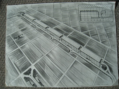
Via Pedestrianist, a possibly circa 1948 plan sketch for something called the Minnatoma Project, which was to involve a row of parking structures connecting the Bayshore Freeway to the Bay Bridge Freeway right in San Francisco. Yikes!
This rendering sure is cringe-worthy. But why? Let's break it down in the comments, one design detail at a time--what's wrong with this picture?
More great pix at Eric Fischer's photostream.
Wednesday, April 7, 2010
figueroa street + olympic boulevard, downtown
Thanks to my pal Mochi for the location request.
Angelenos talk about Downtown much like Bostonians once talked about their Red Sox: there's hope, they're getting closer each year, and so on. Downtown, or DTLA, is constantly on the verge of becoming. And great strides have been made — the LA Live shopping mall finally gives greater context to classics like the Hotel Figeuroa lounge and The Pantry Cafe. But the infrastructure keeps getting in the way. Here, Figueroa streams nine lanes of 50mph traffic — half a freeway, a perfect candidate for infilling. Its auto-centricity is emphasized by that bizarro car wash on the left, whose awkward single story feels sprawly, suburbanish, and wholly inappropriate among downtown's verticality. Interestingly, Figueroa sheds four lanes beyond Olympic; when I narrowed down this scene I noticed not only a cozy picture of density but also the illusion that the whole street had been tied off with a neat T intersection. Talk about traffic calming! See it narrowed!
High quality prints available
Tuesday, April 6, 2010
one to watch: community design group
Nifty little teaser video from Community Design Group in Minneapolis, Minnesota. I'm starting to obsess over quick + dirty methods for visualizing complete streets, and this fits the bill wonderfully. More at their site and YouTube channel.
Monday, April 5, 2010
ocean avenue + santa monica boulevard (II), santa monica
This is one of my favorite spots in Santa Monica. Tapas to the left of us, sushi to the right, and Ye Olde King's Head pub up ahead — all in all, a great place to chill out with a "real" (i.e. Imperial) pint of Boddington's and watch the tourists go by. But there's a slight annoyance: buses. They run right in front of the outdoor seating area, meaning diners get a little diesel with their fish + chips. Passenger cars, annoyed with pesky, pokey public transport, honk + rev away with angry flatulence. This automania almost threatens to ruin the experience; it's hard to fall into the completely deep relaxation found, say, at the nearby car-free 3rd Street Promenade. Narrowed, this terminus of the mighty Santa Monica Blvd. becomes a calm back alley. I left in the "buses only" asphalt paint for fun, because I like to imagine an optimistic near-future in which our current carbon-spewing peoplemovers are replaced by silent gliding electric vehicles. See it narrowed!
High quality prints available
Thursday, April 1, 2010
van nuys boulevard + burbank boulevard, van nuys: the future is wide
I took another look at Van Nuys Blvd., a reader request from a while back, just to re-think what its design intent was. At the 2010 StreetSummit, someone mentioned a little-known DOT rule mandating that portions of certain roads be wide + straight enough to serve as an airplane runway. Mystery, solved. It's a reasonable bit of contingency planning (better safe than sorry), but one that I feel is still woefully inadequate. It doesn't take into account, for example, the case of two jumbo jets landing at the same time, potentially in opposite directions. (It's happened before.) And Mayor Villaraigosa has already pledged to ensure Van Nuys' future as a mixed use district, providing shopping, parking, residences, parking, spaceport facilities, as well as serving as an ideal landing site for potential future (and inevitable) visits by extra-terrestrials, whose looming ships tend to be large + awkwardly shaped (eg. V, District 9). Van Nuys Blvd., currently only eleven (11) lanes wide, needs to be built further out with these New-new Urbanistic goals in mind. Widened, it accommodates a breathtaking 19 lanes — big enough to handle almost anything the Universe can throw its way. See it widened!
Subscribe to:
Posts
(
Atom
)
Previous Posts
-
►
2011
(
9
)
- ► December 2011 ( 1 )
- ► August 2011 ( 1 )
- ► January 2011 ( 2 )
-
▼
2010
(
126
)
- ► November 2010 ( 1 )
- ► September 2010 ( 1 )
-
▼
April 2010
(
21
)
- friday favorites: VW microbus subway
- thursday do-overs: american makeover's "sprawlanta"
- sunset boulevard + doheny road, west hollywood
- google search story: "LA street story"
- wilshire boulevard + 3rd street promenade, santa m...
- friday favorites: tyler street, dallas, texas
- do-over thursday: time-lapse narrowing fun!
- pico boulevard near vermont avenue, byzantine-lati...
- visualization fix: green island
- alley between 3rd + 4th streets off the 3rd street...
- friday favorites: long tang street, shanghai, china
- do-over thursday: NYC DOT's open call for public s...
- reader request: 6th street + spring street, downtown
- visualization fix: taichung gateway project
- spring street bridge, glendale junction
- friday favorites: belden place, san francisco
- do-over thursday: what's wrong with this picture?
- figueroa street + olympic boulevard, downtown
- one to watch: community design group
- ocean avenue + santa monica boulevard (II), santa ...
- van nuys boulevard + burbank boulevard, van nuys: ...
- ► March 2010 ( 34 )
- ► February 2010 ( 22 )
- ► January 2010 ( 23 )
-
►
2009
(
39
)
- ► December 2009 ( 28 )
- ► November 2009 ( 11 )
About the Photographer
- David Yoon
- Los Angeles, CA, United States
-
Writer, designer, and urban planning geek.
Got a location idea or photo submission? Send it to hello@davidyoon.com. I'll post it to the blog or even run out to shoot it myself.
friends
Followers
All content © David Yoon and Narrow Streets: Los Angeles.