Monday, November 29, 2010
pacific coast highway, santa monica
My wife, who grew up near the sleepy beach towns of Jamaica, asks me every time we drive along PCH: who decided to put a freeway next to the ocean? Blemishing the very thing that makes California so famous? We Angelenos have grown used to the mayhem that happens along this famously fast stretch of road, and not just certain Ferrari Enzos sliced in half by crazed millionaires and careening jaunts by drunk neo-Nazi celebrities — crashes on PCH are a regular part of our morning commute. The road is another classic example of the Angelene Paradox: almost daily violence and road rage, but in an idyllic setting. Part of me wishes we could do a better job of living up to our laid-back reputation, but I know better. Hawaii has its traffic jams, for instance. Crime happens in the Bahamas. No place perfectly aligns with its ideal image. But couldn't we, you know, maybe try a little? See it narrowed!
Wednesday, September 22, 2010
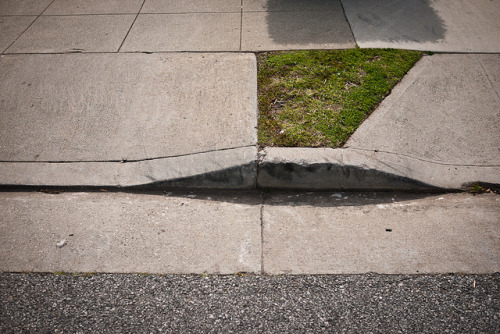
"narrow" is to "streets" as "micro" is to
lawns. Microlawns, another photo blog of mine you may find amusing. It's still urban portraiture, but it's less critique and more absurdist snark. ^_^
Friday, July 30, 2010
Denton, Texas traffic engineer: "The cyclist should consider actuating the pedestrian push button."
Amazing quote from the Head Traffic Engineer in Denton, Texas that pretty much sums up the infrastructural corner we've painted ourselves into. Behind all the technical smoke-and-mirror excuses lies a simple unwillingness to question the wisdom of initial urban design mistakes made long ago.
"It is worth noting that there are no known published national, TxDOT or regional metro policies/standards/guidelines/etc concerning what a "safer" timing is for a bicyclist at a signalized intersection. There are substantial timing and traffic mix/volume variations at every intersection in Denton, further complicating a determination of what a "safer" timing might be that would not only be beneficial to a cyclist but also be defendable in the event of litigation.
Thursday, July 8, 2010
"the geography of somewhere" group exhibit in echo park
Sorry about the lack of posts lately--I had some writing deadlines to take care of, which sucked away all my time. But if you wanna catch up, meet me in Echo Park where I'll be showing Narrow Streets photos in a group art exhibit. Woo hoo!
Fellow artists include Carlos Reynoso, Christopher Bibby, and Joseph Powers Bowman. Should-be-could-be fun!
The show opens tomorrow (July 9) and runs until July 28 at the Echo Park Curiosity Shop ("Echo Curio") at 1519 Sunset Blvd in Echo Park. More show details.
Fellow artists include Carlos Reynoso, Christopher Bibby, and Joseph Powers Bowman. Should-be-could-be fun!
The show opens tomorrow (July 9) and runs until July 28 at the Echo Park Curiosity Shop ("Echo Curio") at 1519 Sunset Blvd in Echo Park. More show details.
Thursday, June 17, 2010
6th street + spring street, downtown (II)
I'm endlessly fascinated by Downtown LA. It teems with life during the weekday; at night and on weekends, it becomes a zombie-filled ghost town worthy of a level design from Left 4 Dead. It is crowded with buildings but at the same time overbuilt for cars — a paradox that leaves it neither here (is it a city?) or there (is it a suburb?). The photo above shows what Angelenos would consider a "small" street at only five cars wide. A similarly-sized street in New York City, by contrast, would be considered a major conduit. 8th Ave, for instance, is as wide as the street above because it borders crowd magnets like Madison Square Garden and Penn Station — makes sense, right? But that's New York City, which has a variety of street sizes befitting local use: one-lane roads for residential neighborhoods, and larger arteries for heavily trafficked areas. In Los Angeles, on the other hand, every street behaves as if it were a regional conduit regardless of actual, boots-on-the-ground use. The city becomes merely a place to pass through, not a destination unto itself, leaving only the roar of traffic and the crazed bellowing of its down-and-out street denizens echoing off its walls. See it narrowed!
Friday, June 4, 2010
friday favorites: power line-free streets
The wonderfully-named Don Quiposte takes streets in Santos, Brazil and re-imagines them without all those unsightly power lines. Her results are quite satisfying, like clearing cobwebs or untangling a big mess of computer cables at home.
From her profile:
Visualizations like hers do a great job of showing the real priorities of a street's design (is it a place for living? Or an electrical conduit?). More photos and commentary at Don Quiposte.
From her profile:
Don Quiposte is an urban activist with the impossible mission of finishing with the electric postes of Santos- Brazil and other cities. Her motto is Impossible is Nothing.
Visualizations like hers do a great job of showing the real priorities of a street's design (is it a place for living? Or an electrical conduit?). More photos and commentary at Don Quiposte.
press log: quesabesde
Hooray! It's always nice to get a mention in one of my favorite blogs — Quesabesde, a camera geek blog, re-posted my how-to video. From the article:
El hombre que estrechaba calles. No, no se trata del poder de un nuevo superhéroe… a menos que el dominio de Photoshop sea considerado como tal.
Tuesday, June 1, 2010
wilshire corridor
I like to think of Wilshire Corridor as LA's own sort of Upper East Side Park Avenue, with its long stretch of luxury condo high-rises catering to the older wealthy. I can even imagine Eloise traipsing along, au pair in pursuit, on her way from Westwood to Beverly Hills. But as with all things Los Angeles, this east coast facsimile has a unique west coast twist: eight lanes of heart-pumping traffic careening up and down its hilly curves at a blistering 55mph. (Try it on a 125cc scooter, and it's even more hair-raising.) The usual paradox is there: heavenly towers with names promising old world grandeur ("The Wilshire Marquis", or the more pastoral "Carlyle on Wilshire") located right alongside what is practically a freeway. Me + the wife looked here once for an apartment, and could not get past the constant echo of traffic, double-paned windows be damned.
The toughest paradox about Wilshire Corridor's sheer speed is the impact is has on its residents, many of whom are older. Nowhere on Wilshire is pleasant to walk along, and the Corridor is no exception. So they take to their Lexuses and Jags instead, tentatively nosing them into the automotive stream before gunning it to catch up with the fast flow. The result is a desolate but beautifully manicured towerscape reminiscent of those pearly retirement enclaves in Florida: waiting rooms for those next in line for ascention, cordoned off from the rest of the living. See it narrowed!
press log: boing boing
Featured by guest blogger Bill Barol, former senior writer at Newsweek and contibutor to The New Yorker, Time, Slate, and elsewhere. He blogs at True/Slant and Pix365.
Thursday, May 27, 2010
Wednesday, May 26, 2010
Tuesday, May 25, 2010
interview: lost in a supermarket
Had a really fun Q + A with Nicholas Stetcher from his awesomely-named Lost in a Supermarket blog. A silly excerpt:
Q: Do you often work with music in the background? If so, what inspires your work or makes the labor more endurable?
A: I usually listen to whatever pops up on the iPod. The Shins are a favorite, or Erlend Oye, Vampire Weekend, Nine Inch Nails, or The Futureheads. Pan Sonic makes me drop everything and become catatonic.
Friday, May 21, 2010
friday favorites: university of california at berkeley
Reader Severin Martinez sent in a snapshot of the Berkeley campus (my alma mater...go Bears!) near the Campanile.
A campus is a great example of a pedestrian-centric urban development, if you think about it. Roads are narrow, there are plenty of facilities for bikes and people (park benches, water fountains, shaded paths, cafes, bike racks, even emergency police call boxes), and the pace is generally slower and much more pleasant than the freaky nonstop Death Race 2000 happening right outside its gates. This road has sharrows to remind drivers of its mixed use nature, and it's only wide enough to let two cars pass, no wider — a bigger street would only invite speed.
Successful models for "car-light" urban design exist all around us (think outdoor shopping malls or even movie studio lots), and there's no reason we couldn't apply the same design patterns to everyday streets.
Got a Friday Favorite of your own? Send 'em in.
Thursday, May 20, 2010
press log: the league of ordinary gentlemen
Mentioned in The League of Ordinary Gentlemen, which I in turn mention simply because I love that blog title so much.
Wednesday, May 19, 2010
omg: street widening in pre-wwii moscow
Via Gizmodo via English Russia, photos of an entire city block being moved to widen (yes, widen) a street in 1930's Russia. Who says the opposite couldn't be done? ;)
More crazy pics and detailed history, plus before + after photos, at English Russia.
press log: los angeles times
Brief little mention on LATimes, within a news round up headlined by...Octomom. Holy non-sequitur, Batman.
Tuesday, May 18, 2010
press log: good
Featured on GOOD. God, I admire the hell out of those guys. I'm thrilled to be keeping company with them.
press log: io9
Featured on io9, one of my absolute favorite blogs that's dedicate to all things science fiction.
Monday, May 17, 2010
Thursday, May 13, 2010
press log: it's nice that
Featured by the superfriendly Alex Bec on his fabulous London-based blog. And I thought only Angelenos would care about this stuff.
Friday, May 7, 2010
friday favorites: floating logos
From Matt Siber (via my pal Jacob), carefully Photoshopped portraits of roadside signage with their supporting structures removed. From Matt's statement:
For me, they also show how signage designed for cars and not humans can literally loom over our heads, distant and free of context like a silent sentinels visiting from another planet, adding to an already alienating landscape of sprawl. More beautiful work at Matt's site.
Got a Friday Favorite of your own? Send 'em in.
Making the signs appear to float not only draws attention to this type of signage but also gives them, and the companies that put them there, an otherworldly quality. References can be drawn to religious iconography, the supernatural, popular notions of extraterrestrials, or science fiction films such as Blade Runner. Each of these references refers to something that can profoundly affect our lives yet is just beyond our control and comprehension.
For me, they also show how signage designed for cars and not humans can literally loom over our heads, distant and free of context like a silent sentinels visiting from another planet, adding to an already alienating landscape of sprawl. More beautiful work at Matt's site.
Got a Friday Favorite of your own? Send 'em in.
Thursday, May 6, 2010
santa monica boulevard + sepulveda boulevard, westwood
Here's the intersection right around the corner from my house. The office towers proudly call themselves the "Gateway" to "Westwood," but I think of it as the point where the great Beverly Hills Freeway comes to an end, abruptly cutting off its dedicated bike lanes and continuing its auto-frenzied free-for-all to the sea. The buildings, far from being an integrated part of their surrounding urban ecosystem, function as self-contained acrologies right out of Sim City and leave pedestrians to fend for themselves against the river of cars that fight for space in the transition from freeway speeds to the daily bottleneck caused by the entrance to the 405 just ahead. This intersection suffers from the classic Los Angeles problem of being a landmark solely on paper; as a destination, it offers nothing for those walking on the street. Narrowing it reveals its true autocentric nature: the lawns on the left become an absurdist ghost park, and the columns on the right suddenly feel disproportionately huge. Like many places in the city it's a perfect candidate for infill by new retail, something I'm sure the workers in those towering offices would rejoice at. See it narrowed!
Tuesday, May 4, 2010
alley, santa monica
When I used to live in Santa Monica I would walk one mile to work each way, a lovely commute that seems enviable now. I tended to avoid busier streets like Montana, Washington (which has become an overcrowded, illusory "shortcut" to nearby Wilshire), and the "3n+2" streets: 11th, 14th, and 17th, all of which have signal lights and therefore invite faster traffic.
Instead, I would opt for the alleyways permeating this residential area. Smaller, quieter, and generally car-free, they're inviting places to walk with less purpose and more pleasure, to peer at cats hiding under cars, or glass flowers on a windowsill. Alleys are a missed opportunity; in most minds they're places for "dirty" functions like trash collection and parking, but those activities take up only a fraction of their time each day. The rest of the time they are no-cars-lands, effectively becoming some of the most meditative walking paths in the city. Narrowing this alleyway in particular reveals its true nature: an intimate, silent haven. See it narrowed!
Friday, April 30, 2010
friday favorites: VW microbus subway
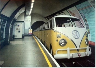
A classic Volkswagen Microbus, put to much better use. Thanks to reader Marc Phu for the tip, via the Racionais Pra Tudo tumblog.
Every Friday I'll post a narrow or otherwise interesting street snapshot from somewhere around the world (or in this case, a striking photo mashup!). Got a Friday Favorite of your own? Send me your photos!
Thursday, April 29, 2010
thursday do-overs: american makeover's "sprawlanta"
The average Atlantan drives 60 miles a day? "Drive 'til you qualify" for affordable housing, indeed. Filmmaker John Paget continues to kick ass all over the place with his great documentary, which is peppered with eyebrow-raising factoids such as "3 pedestrians get struck every week" on the streets of Atlanta (many of which routinely stretch 8 lanes wide). Or how about: Gone With the Wind author Margaret Mitchell was killed crossing the street in this city — an idiot death for such a brilliant writer.
This film makes its point loud + clear: the time is ripe for a major do-over on a nationwide scale! Maybe it's time for a Narrow Streets: Atlanta edition..?
Wednesday, April 28, 2010
sunset boulevard + doheny road, west hollywood
If you head just west of the Key Club on Sunset Strip, stop at Gil Turner's liquors, and look downhill, you'll see this long downhill view. It's a bit vergitinous, and cars do indeed bomb down it at speeds reaching 50mph. All the roads perpendicular to the Sunset Strip are like this: a deadly matrix of intersections that invite danger. I should know: I used to work in this neighborhood, where a motorcyclist lost his life one day.
Tuesday, April 27, 2010
google search story: "LA street story"
My YouTube Search Story, about a search for escape from car commuting that becomes the inspiration for positive change. This Search Story thing is fun!
I just had to show how NS:LA seems to show up a lot in Google image search, which is how about a third of my visitors find me. Wacky!
Monday, April 26, 2010
wilshire boulevard + 3rd street promenade, santa monica
This is probably one of the most well-populated intersections in Santa Monica, in terms of foot traffic, being situated at the end of the 3rd Street Promenade as it is. It's not without its problems, however — cars waiting to make left turns creep impatiently toward the throngs of crossing pedestrians, spoiling the shopping fun by unnecessarily rushing tourists + locals alike. It's also dangerous, too: pedestrians get hit most by cars making careless left turns, especially at larger intersections where the line of sight is more distant. 3rd + Wilshire is a perfect candidate for conversion into a public square, with a fountain or statue in its center. But for now, let's imagine that the charm of the world-famous Promenade follows through all the way to its terminus and beyond, with a nicely narrowed street that clearly indicates who it belongs to: the people! See it narrowed!
High quality prints available
Friday, April 23, 2010
friday favorites: tyler street, dallas, texas
Something amazing: local residents and Go Oak Cliff + Bike Friendly Oak Cliff members transform a blighted, car-wild street in human-hostile Dallas into an irresistible public space right out of old Yurp. I love the dramatic difference in traffic speed before and after conversion — the latter sense of safety is clearly apparent. The whole project perfectly highlights what complete streets do best:
- Slow traffic with narrower streets
- Encourage jaywalking
- Create bonus retail space
- Give people a no-pressure reason to be outside: not to commute, or run a 10k, but simply to relax!
Apparently this inspiring fit of guerilla activism was so successful that Dallas DOT wants to make some of the changes permanent. And two other Texas cities have asked the BFOC to re-create the event in their streets, too.
Nice to see this bunch of "complete" freaks in action!
Via Bike Friendly Oak Cliff.
Every Friday I'll post a narrow or otherwise interesting street snapshot from somewhere around the world. Got a Friday Favorite of your own? Send me your photos!
Thursday, April 22, 2010
do-over thursday: time-lapse narrowing fun!
Remember that Spring Street bridge I narrowed a little while back? Well, here's how I went about it. View full-screen to see the interface details better.
I used Photoshop, but there's plenty of free, open-source altenatives, including GIMP. The key is getting your initial shots nicely aligned.
Wednesday, April 21, 2010
pico boulevard near vermont avenue, byzantine-latino quarter
Thanks to Nirad Gupta at SIFTAngeles for the location request.
I came here to shoot photos at 9am on Easter Sunday, and even at that early hour the streets were already filling up with 50mph traffic. But during the periods of silence in between packs of swiftly moving cars I was able to focus on the human face of the neighborhood's soul: its considerable foot traffic. Foot traffic which, on a narrower street, feels more at ease.
On paper, the Byzantine-Latino Quarter has a long, rich record of ethnic ebb + flow; a neon sign and inspirational mural on the corner of Pico + Normandie give clues to those origins. Otherwise, it's tough to get a sense of any of its history at street level. The BLQ is crying out for a public square to physically mark its center and give the neighborhood a sense of permanence — its official center at Pico + Union only features disappointingly typical stripmall carchitecture. But streets this wide + fast defy public space. Like most designations in LA its identity seems temporarily written, an abstract construct of the mind marked only by blank rivers of asphalt; a figment poised to be gentrified into oblivion without even a statue to mark its passing. See it narrowed!
High quality prints available
Tuesday, April 20, 2010
visualization fix: green island
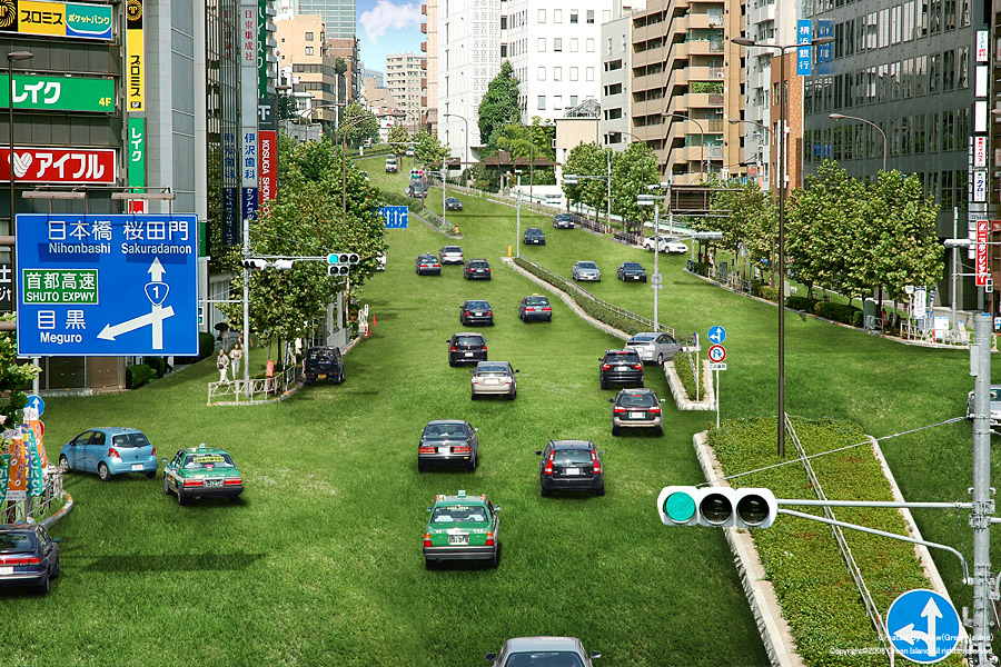
An oldie but a goodie: Green Island by tag, IMKW, and immr in Japan. I've actually had dreams along these lines, where all the asphalt of the city was replaced by fields of green. In my dreams people would drift race like maniacs on the slippery grass to wherever they were going, the smell of freshly muddled sod in the air. Really fun, actually.
These fantastic, outrageous visualizations are the next best thing to dreams. It's amazing how green grass brings an instant sense of calm to a normally chaotic scene. The creators behind Green Island don't do many of these, but when they do they're always impeccably detailed + stunning. They've even branched out to France, Vietnam, and right here in US, in Las Vegas:
Monday, April 19, 2010
alley between 3rd + 4th streets off the 3rd street promenade, santa monica
Remember that alleyway in Santa Monica with Westside Comedy Theater? The one that's just dying to have a bar put in next door? Well, I revisited it.
Alleyways are such a restrictive form of urban design — they separate + compartmentalize the "uglier" functions of the city, i.e. trash collection, and unwittingly create creepy, crime-ridden dead zones in the process: a telltale sign of an unhealthy monoculture. Cities like New York or Paris mix things up more, putting smaller batches of trash out in the open for more frequent pickups. Their streets may smell a little more ripe, but they're still nothing compared to the rank, concentrated fumes lurking in LA's cesspool alleyways. Distributing functions more evenly across the urban system (even the smellier ones) would reduce restrictions on what alleys can + can't be used for. And it would also literally open up miles of fresh real estate for entrepreneurs to play with. So with that in mind, I installed a bar next door to this comedy club: the Cabo Cantina, transplanted from just one street over on the 3rd Street Promenade. Hellooo, fun! See it bar-ified!
High quality prints available
Friday, April 16, 2010
friday favorites: long tang street, shanghai, china
Photo: PitBox.
I saw plenty of streets just like this one when I travelled around China years ago. At only 8 feet wide, there's still plenty of room for scooter parking, laundry, life, and mystery.
Every Friday I'll post a narrow or otherwise interesting street snapshot from somewhere around the world. Got a Friday Favorite of your own? Send me your photos!
Thursday, April 15, 2010
do-over thursday: NYC DOT's open call for public space proposals!
This is incredible. New York's Department of Transportation, headed by the supergreat Janette Sadik-Khan, has opened itself up for proposals to reclaim wasted city space to create new public plazas. It's an amazing effort to get locals involved in defining their environments and improving their quality of life — what a concept! From the overview:
NYC DOT will work with selected not-for-profit organizations to create neighborhood plazas throughout the City. We will do this by transforming underused streets into vibrant, social public spaces. This Program is a key part of the City's effort to ensure that all New Yorkers live within a 10-minute walk of quality open space.
The deadline's June 30, 2010. I can imagine some really sweet visualizations will come out of this call-to-arms. Urban design by the people, for the people! Does Los Angeles have the guts to do something similar? Or will we forever defer to traffic engineers?
Wednesday, April 14, 2010
reader request: 6th street + spring street, downtown
Thanks to Phillip Estes from Los Angeles County Regional Planning for the location request.
This intersection is a perfect example of that "almost there" feeling I get whenever I visit Downtown: the buildings have the trappings of an old, urban center; there's even foot traffic. The only thing holding it back are the streets, which at five lanes in either direction still allow cars to travel at unreasonable speeds — speeds which effectively prevent easy jaywalking and turn the sidewalks into long, dead alleys. It's an important detail, given the sketchy types that can frequently be encountered when walking in Downtown. Smaller streets provide more "escape" routes and give even sparse foot traffic greater density, mixing normal folks closer in with the crazies, providing a sense of safety in numbers: crazies are fine in my book, as long as they're vastly outnumbered by us normals. But larger streets thin out the crowds and increase approach distances, bringing a sense of dread that gives creepy types time + license to act even creepier. So I got a little ambitious with this rendering, narrowing not just one axis of the street but all four corners to shrink the entire intersection down by 75%. The result is a scene straight out of NYC.
Apologies for the slightly blurry background building — as I was taking the shot I was jarred by a driver who felt the need to honk and yell at me ("What the hell is wrong with you?"), even though it was 8:00am on a Sunday and he had four other completely empty lanes to choose from. Driving indeed brings out the savage child in all of us. See it narrowed!
High quality prints available
Tuesday, April 13, 2010
visualization fix: taichung gateway project
Takuma Ono brings us this lovely visualization of a riverbed public space designed to bring some green to urban Taichung, Taiwan. It's a slick realization, effectively blending 3D animation with simple stills (the soccer players at around 1:00). The stark white buildings allow proper showcasing of the green space, the project's core theme. Another nice touch is at 2:13, where a soccer game is projected onto a wall, emphasizing free outdoor events for the community. Reminds me of summer movie nights at the Hatch Shell at Boston's Esplanade riverfront. Fireworks at the end of the visualization serve to remind us that these sorts of improvements are all about raising the quality of life. Nice!
Takuma participated in GOOD Magazine's Redesign Your Street contest and was a gracious supporter of the Envisioning Urbanism photo exhibit at the 2010 LA StreetSummit.
Monday, April 12, 2010
spring street bridge, glendale junction
Los Angeles has a fair share of bridges, bridges that can actually be quite pretty: the one above features farily detailed moulding, ornate streetlamps, and even a dedication plaque. Sadly, these details vanish when viewed from a car at 50mph, the routine speed of traffic moving along its four lanes. And so we're left with that empty, apocalyptic feeling again — here someone went through the trouble of decorating a bridge for an audience that will never bother to look. One of the biggest problems with moving as fast as we do, each + every day, is that there's no longer any practical reason to make things beautiful. People moved slower in 1929, when this bridge was originally built, so attention to detail made sense. But now, such notions are considered quaint, even naive, turning this bridge into a living ruin. It's a shame, because everyday beauty has the secret power to improve our quality of life at an almost subliminal level. See it narrowed!
High quality prints available
Friday, April 9, 2010
friday favorites: belden place, san francisco
Thanks to Jacob and his CIVICnurgs for the tip.
Here on this beautiful, sunny Friday we have a lovely alley cafe in...San Francisco?!?! Yep, this ain't Yurp — It's the good ole' USA. Photo from an inspiring article about the cultural value of alleys from George Calys at Examiner.com.
Jacob also forwarded an LA Times article about the growing trend to reclaim heretofore wasted alley space from drug dealers + criminals and transform them into places to live. Plus a link to the absolutely wonderful USC Center for Sustainable Cities' Alleys Project page, which has tons of resources with which to fire your imagination. Bzzzrt!
There are literally thousands of opportunities to convert alley space in our fair city. For instance, the Westside Comedy Theater in a Santa Monica alley is just dying to have a bar installed next door:
Photo from LAist.
Every Friday I'll post a narrow or otherwise interesting street snapshot from somewhere around the world. Got a Friday Favorite of your own? Send me your photos!
Subscribe to:
Posts
(
Atom
)
Previous Posts
-
►
2011
(
9
)
- ► December 2011 ( 1 )
- ► August 2011 ( 1 )
- ► January 2011 ( 2 )
-
▼
2010
(
126
)
-
►
May 2010
(
16
)
- press log: planetº magazine
- press log: photojojo
- press log: zeitgeist studios
- interview: lost in a supermarket
- friday favorites: university of california at berk...
- press log: the atlantic
- press log: the league of ordinary gentlemen
- omg: street widening in pre-wwii moscow
- press log: los angeles times
- press log: good
- press log: io9
- press log: archinect
- press log: it's nice that
- friday favorites: floating logos
- santa monica boulevard + sepulveda boulevard, west...
- alley, santa monica
-
►
April 2010
(
21
)
- friday favorites: VW microbus subway
- thursday do-overs: american makeover's "sprawlanta"
- sunset boulevard + doheny road, west hollywood
- google search story: "LA street story"
- wilshire boulevard + 3rd street promenade, santa m...
- friday favorites: tyler street, dallas, texas
- do-over thursday: time-lapse narrowing fun!
- pico boulevard near vermont avenue, byzantine-lati...
- visualization fix: green island
- alley between 3rd + 4th streets off the 3rd street...
- friday favorites: long tang street, shanghai, china
- do-over thursday: NYC DOT's open call for public s...
- reader request: 6th street + spring street, downtown
- visualization fix: taichung gateway project
- spring street bridge, glendale junction
- friday favorites: belden place, san francisco
- ► March 2010 ( 34 )
- ► February 2010 ( 22 )
- ► January 2010 ( 23 )
-
►
May 2010
(
16
)
-
►
2009
(
39
)
- ► December 2009 ( 28 )
- ► November 2009 ( 11 )
About the Photographer
- David Yoon
- Los Angeles, CA, United States
-
Writer, designer, and urban planning geek.
Got a location idea or photo submission? Send it to hello@davidyoon.com. I'll post it to the blog or even run out to shoot it myself.
friends
Followers
All content © David Yoon and Narrow Streets: Los Angeles.